Skip to content
Amelio NazarkoProduct Designer&Poet

Drops the ampersand onto the flippers. Left and right arrow keys flip; Escape sends it home.

“Pear Deck Learning” with its four products, Assessment, Deck, Practice and Tutor, on dark green between illustrated pear characters

Pear Deck Learning

Consolidating four ed-tech products into one learning ecosystem


What the rebuild covered

GoGuardian had four ed-tech products (Pear Deck, Giant Steps, Edulastic, and TutorMe), each on its own domain with its own look, and wanted to sell them as one ecosystem under Pear Deck Learning. Three were renamed for it: Pear Practice, Pear Assessment, and Pear Deck Tutor.

At Supervillain, I designed the information architecture and design system for the new site, while Koto led the brand.
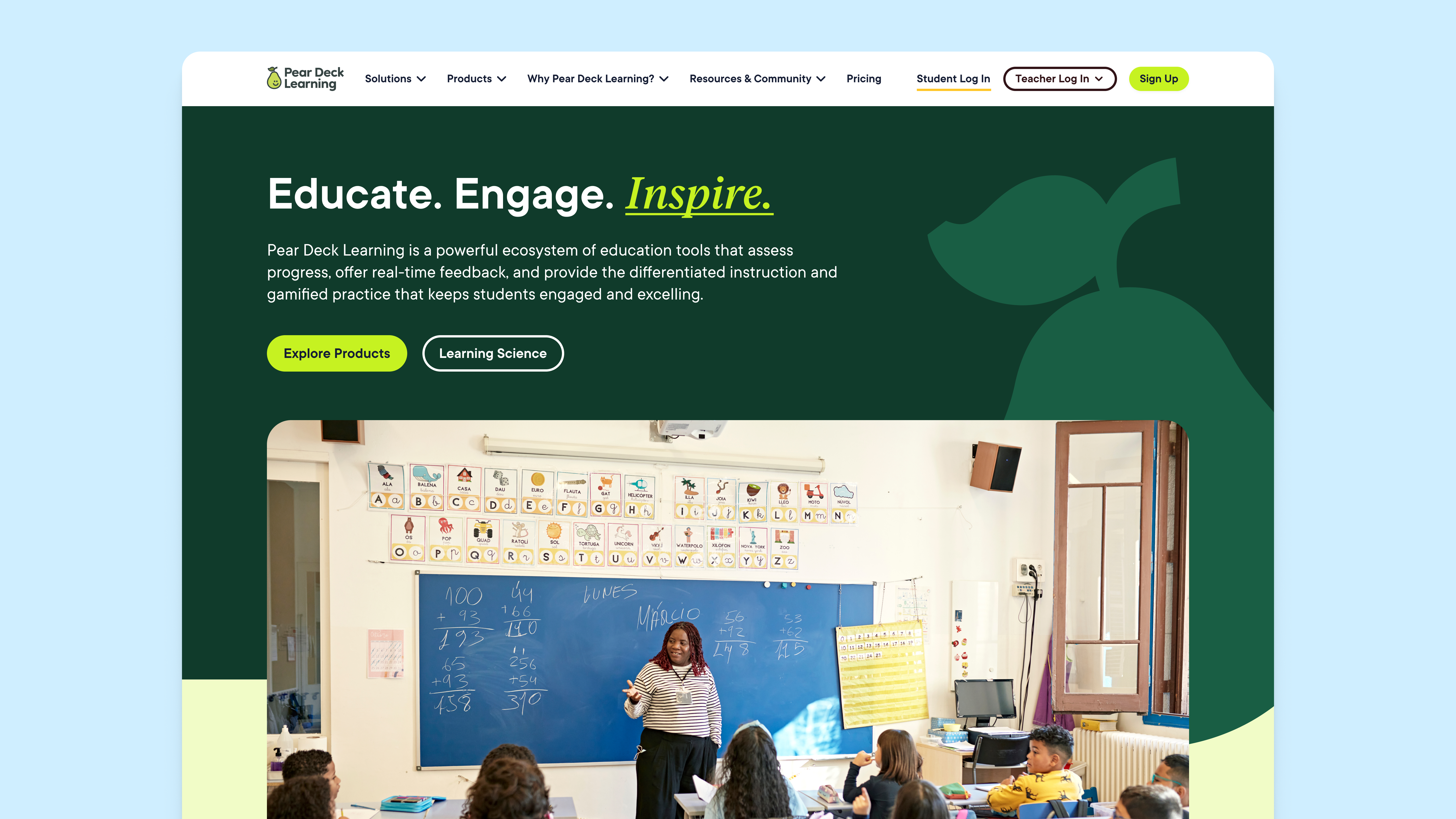
Pear Deck Learning home page: “Educate. Engage. Inspire.” on dark green above a classroom photograph

Where the products overlapped

I started by auditing the four sites against the needs they were sold for. Many of those needs, like real-time student feedback, took two products or all four, and no page explained the whole picture.
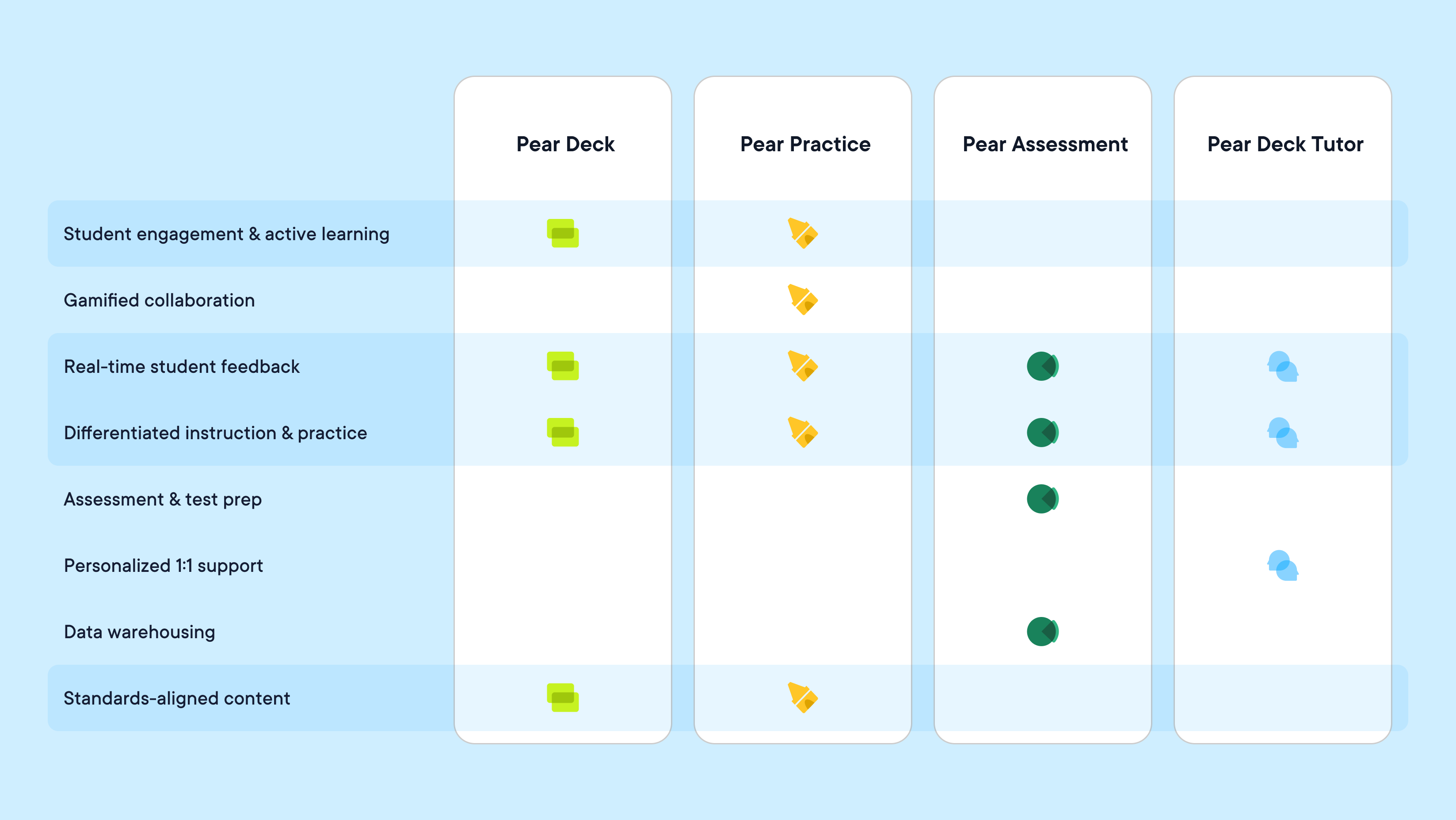
The eight needs Pear Deck Learning was sold for, against the four products: Pear Deck, Pear Practice, Pear Assessment, and Pear Deck Tutor. Four rows are highlighted because they take more than one product: student engagement and active learning and standards-aligned content (Pear Deck and Pear Practice), and real-time student feedback and differentiated instruction and practice (all four). Gamified collaboration is Pear Practice’s alone, assessment and test prep and data warehousing are Pear Assessment’s, and personalized 1:1 support is Pear Deck Tutor’s.

Two ways in

A section per product would have kept those needs split up. The core of my work was a two-axis architecture: visitors browse by product or by use case, so educators, administrators, and tutors each enter through the axis that fits them.

The Products menu opening on Pear Deck Learning, each product tagged with the brand it replaced, then the Solutions menu with By User and By Use Case columns side by side

One section, three settings

Every use case got a landing page built around the products that serve it. Instead of designing each page from scratch, I built one section with three settings: the whole set, a pair, or a single product.

The use-case section in three settings. The whole set shows all four product icons over “Make learning personal.” A pair shows Pear Deck with Pear Practice over “Learn and practice with standards-aligned content.” Single products show Pear Practice and Pear Deck Tutor, each in its own color. Each setting appears twice, faded first and then in full.

One system, four products

I turned Koto’s product colors and illustration styles into tokens and variables for a multi-product design system, so each tool stays recognizable while every page shares one grid, type system, set of templates, and navigation.


A card’s settings panel switching Product Style from Pear Assessment to Pear Deck, Pear Practice, and Pear Deck Tutor. Type and buttons stay the same for every product while graphics and backgrounds change, so the card, “Pear Assessment is only one part of Pear Deck Learning,” takes each product’s name and colors in turn.
Pear Deck Tutor product page in sky blue: “Around-the-clock tutoring”
Pear Deck product page in lime: “Give every student a reason to engage”
Pear Practice product page in yellow: “Practice that feels like play”
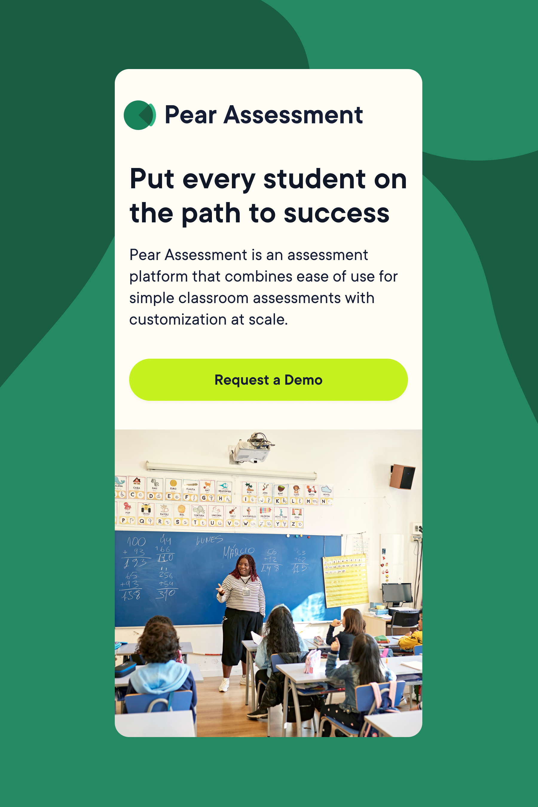
Pear Assessment product page in green: “Put every student on the path to success”

What it made possible

The system sped up page builds and kept the products from drifting apart. When Pear Start, an AI lesson-planning tool, launched later, it fit right in with no re-architecture.

View the live site (opens in a new tab)
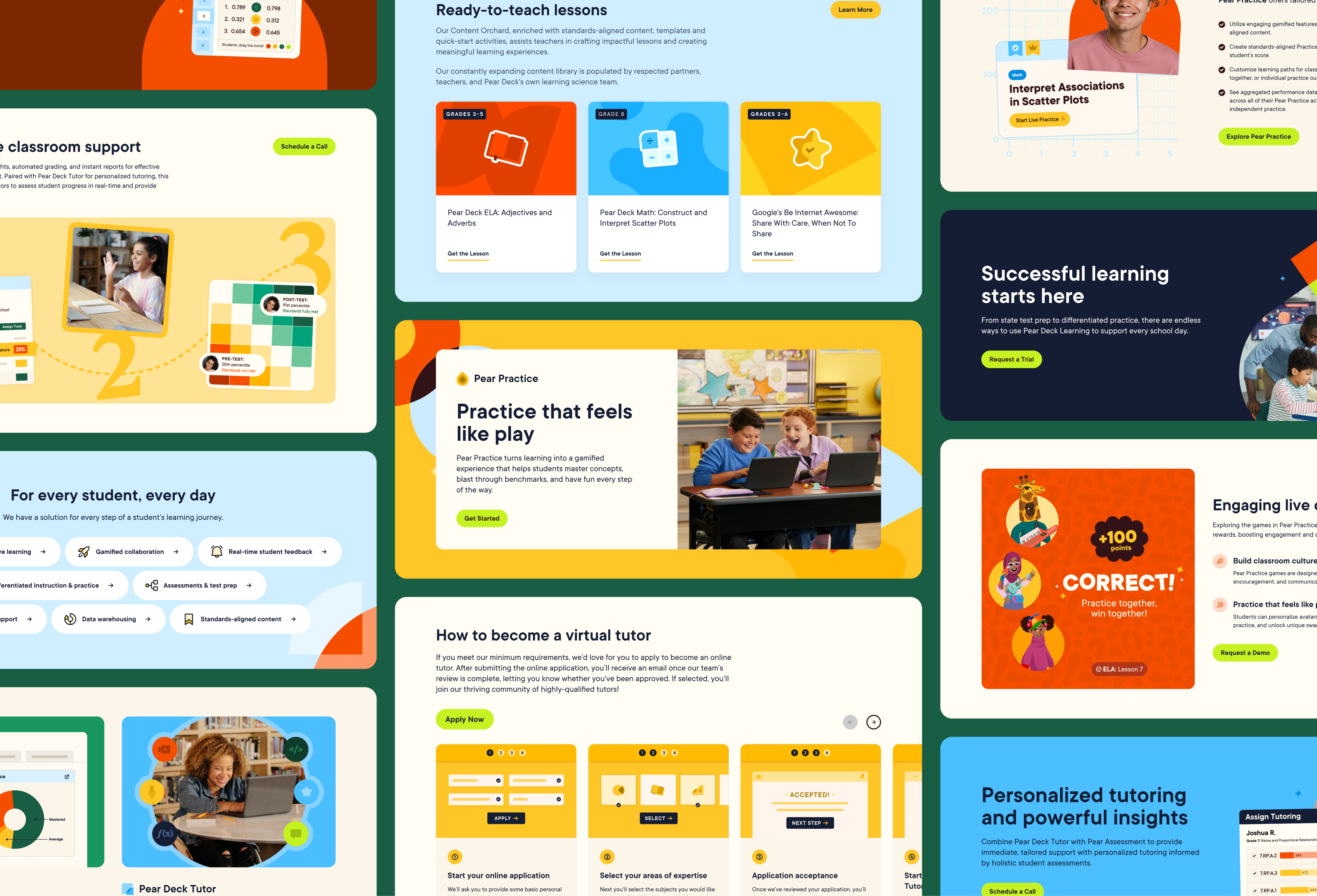
Sections from across Pear Deck Learning in a collage: ready-to-teach lessons, Pear Practice “Practice that feels like play,” steps to become a virtual tutor, classroom support, and personalized tutoring insights