Stanford Health Care
Search Experience
What the rebuild covers
Stanford Health Care's website is the front door to the hospital system. Patients find doctors there, book appointments, read about conditions, and locate clinics.
Patients could already search across doctors and clinics, but the switch control was buried.

Patients were already crossing directories. Most of them never found the way.
Six months of internal analytics showed the problem. Across roughly 190,000 keyword searches, 21% returned nothing. And in about one of every seven searches that touched the directory filter, people selected more than one directory in the same session.
That undercounts the behavior. It only captures the patients who found a control most people never saw. If that many were getting through a buried affordance, the want behind it is bigger.
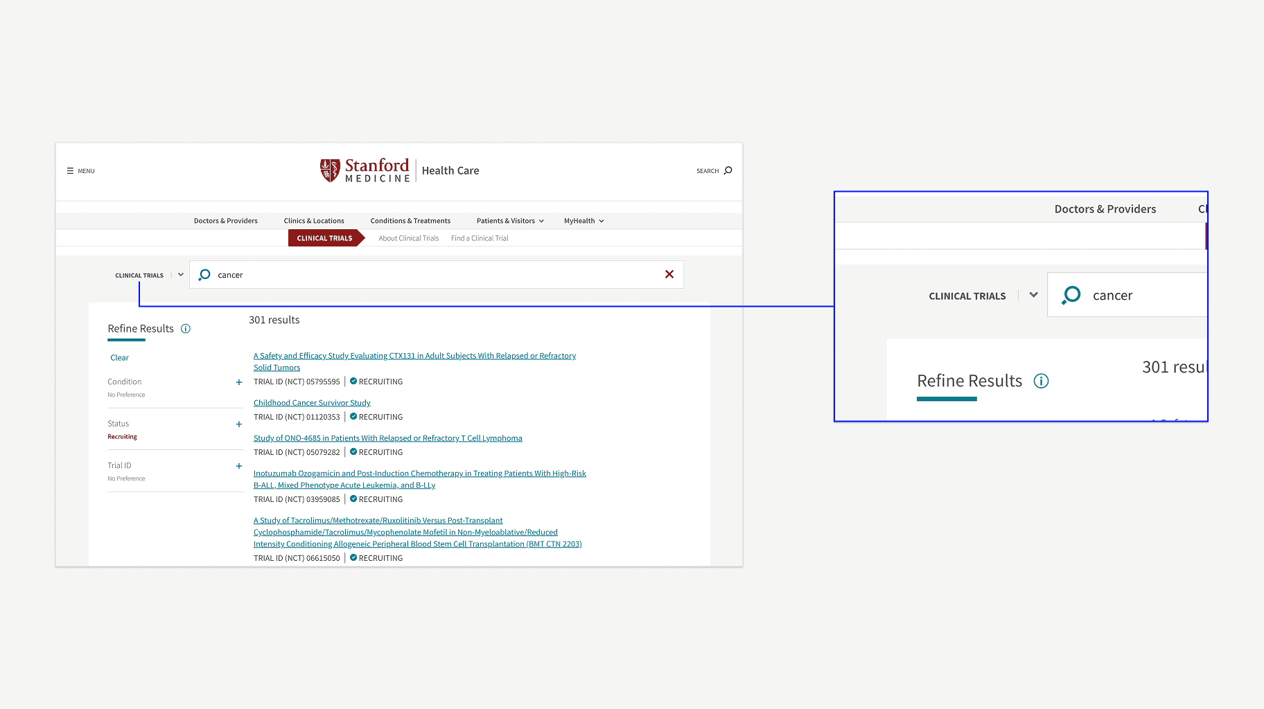
Entity type became a mode inside one session
The shell stays put. A local nav pinned to the top swaps what you're searching, and your input and filters survive the switch. You move sideways instead of starting again.


The search entry point that didn't make phase one
In health care people often search around a fear rather than a keyword, so I proposed curated start pages for each entity type, so someone could browse instead of having to name what they wanted.
Engineering pushed back on phase-one scope and the pages were cut. I still think they were right for the patient and wrong for the timeline.
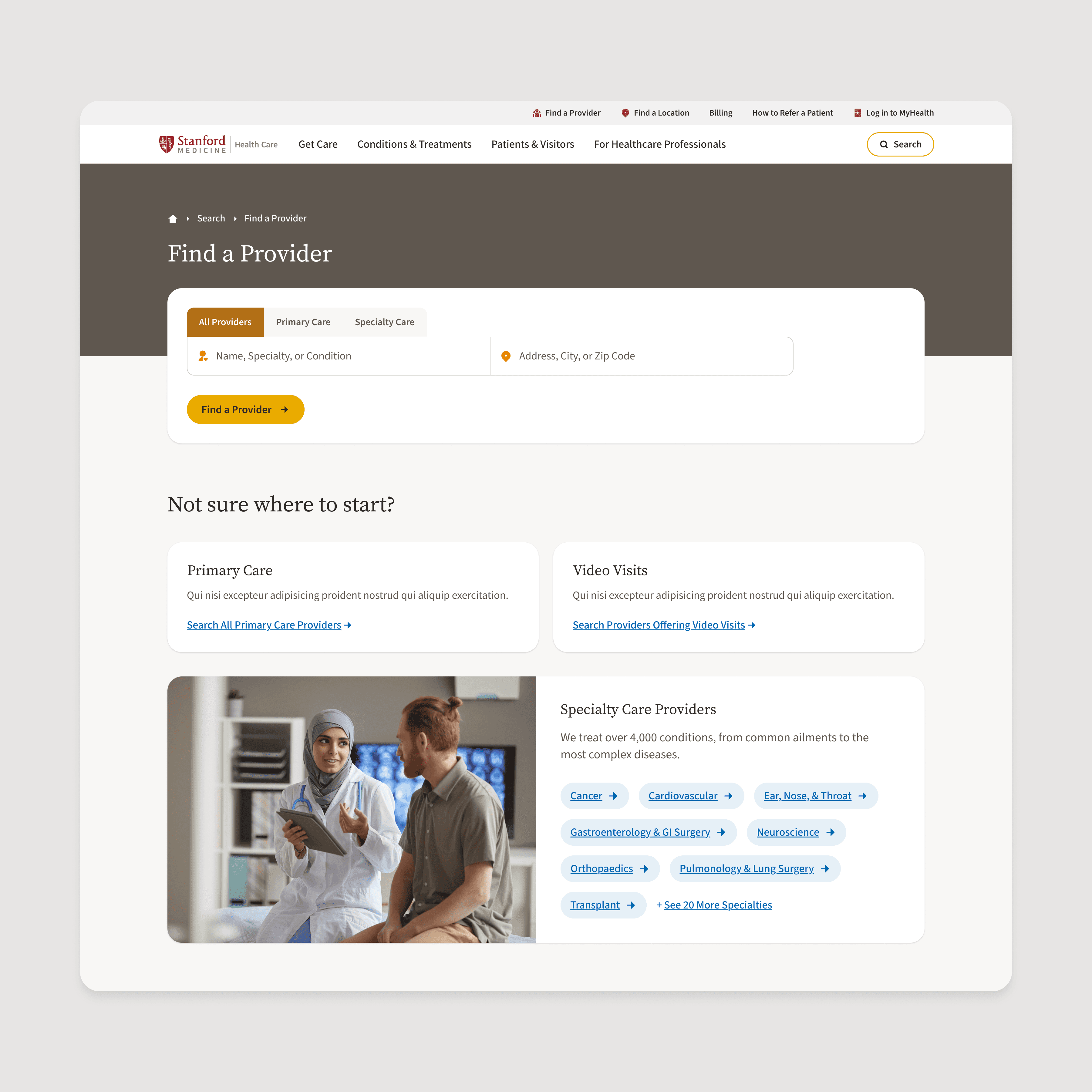


Where the switcher doesn't belong
We also tried putting the entity toggle next to the keyword field in global search. People reach for global search when they don't know what they want, so asking them to pick a type before they've typed anything forces a commitment they haven't made yet.
Autocomplete does that work instead. It ranks the entity types a query is likely to belong to and groups suggestions under labeled headings, two or three per group, each with a link to the full results.
The empty state assumes failure is normal
Three quarters of zero-result searches came from terms used five times or fewer. No synonym list catches that tail. So the empty state guesses at intent, offers a correction, and falls back to browsing matched to what was searched. A failed location search lands you in regions.

Where color came in
The brand was built for print. A palette, two typefaces, and no rules for how any of it behaves on a screen. So we gave color a job. Primaries say what kind of page, utility colors say what to do.
Every page on the site is one of four things: Brand, Care Delivery, Location and Infrastructure, or Utility. Every page type in the inventory got assigned one, and Utility absorbed most of the real site: conditions, treatments, tests, forms, medical staff.


How that affected search
Search is the only page that covers every entity at once, which made it the kind of question a team can argue about for a week. We landed on Clay. Clay carries place, groundedness, and infrastructure, and a search page is infrastructure.
Clay only sets the environment at the top. Past the header the shell goes neutral. Results are dense reference content, and the switcher, the input, and the filters are controls, so they take utility styling instead of a primary. Same rule as every long page in the system. Patient tasks trump branding.
