Stanford Health Care
Digital Design System & Creative Direction
What the rebuild covers
Stanford Health Care's website is the front door to the hospital system. Patients find doctors there, book appointments, read about conditions, and locate clinics. The rebuild covers all of it.
I led design end-to-end, partnering with a Head of Product and another product designer, and carried the work from research synthesis into production-ready UI and system specs.

What made it challenging
The brand identity was built for print and environmental use. It had a palette and two typefaces and no rules for how either behaves on a screen. The site had grown by accretion. Dozens of page types added over years, with no shared logic connecting them.
"Patient Modern" creative direction & principles
Patient Modern is the creative direction I set for the rebuild, it defines how layout, language, and visual signals reduce patient stress while keeping the UI modern and consistent.
Clarity is care: Clear language, structure, and actions reduce patient stress and build trust.
Signals with purpose: Color, emphasis, and graphical cues should guide instead of decorate.
Intelligence with empathy: Layouts, photography, and interactions should feel informed and emotionally resonant.


Color as taxonomy
Every page on the site is one of five things: Brand, Care, Provider, Location, or Utility/Hub. Brand pages are top-level and promotional — the homepage, Why Choose Stanford. Care pages are entry points to treatment. Provider pages are doctor profiles. Location pages are regions, buildings, and clinics. Utility and Hub pages are indexes and dense reference content: conditions, treatments, tests, forms, resource centers.
Four of those five take a color. Cardinal for Brand. Brick for Care, and for Provider, because a provider page is care delivery. Clay for Location. Utility and Hub pages get neutrals and no primary at all.
Every page type in the site inventory was assigned an entity. Utility and Hub absorbed most of the designs: medical staff, sustainability, conditions, treatments, tests, forms. The color system's main job turned out to be restraint.


The search experience
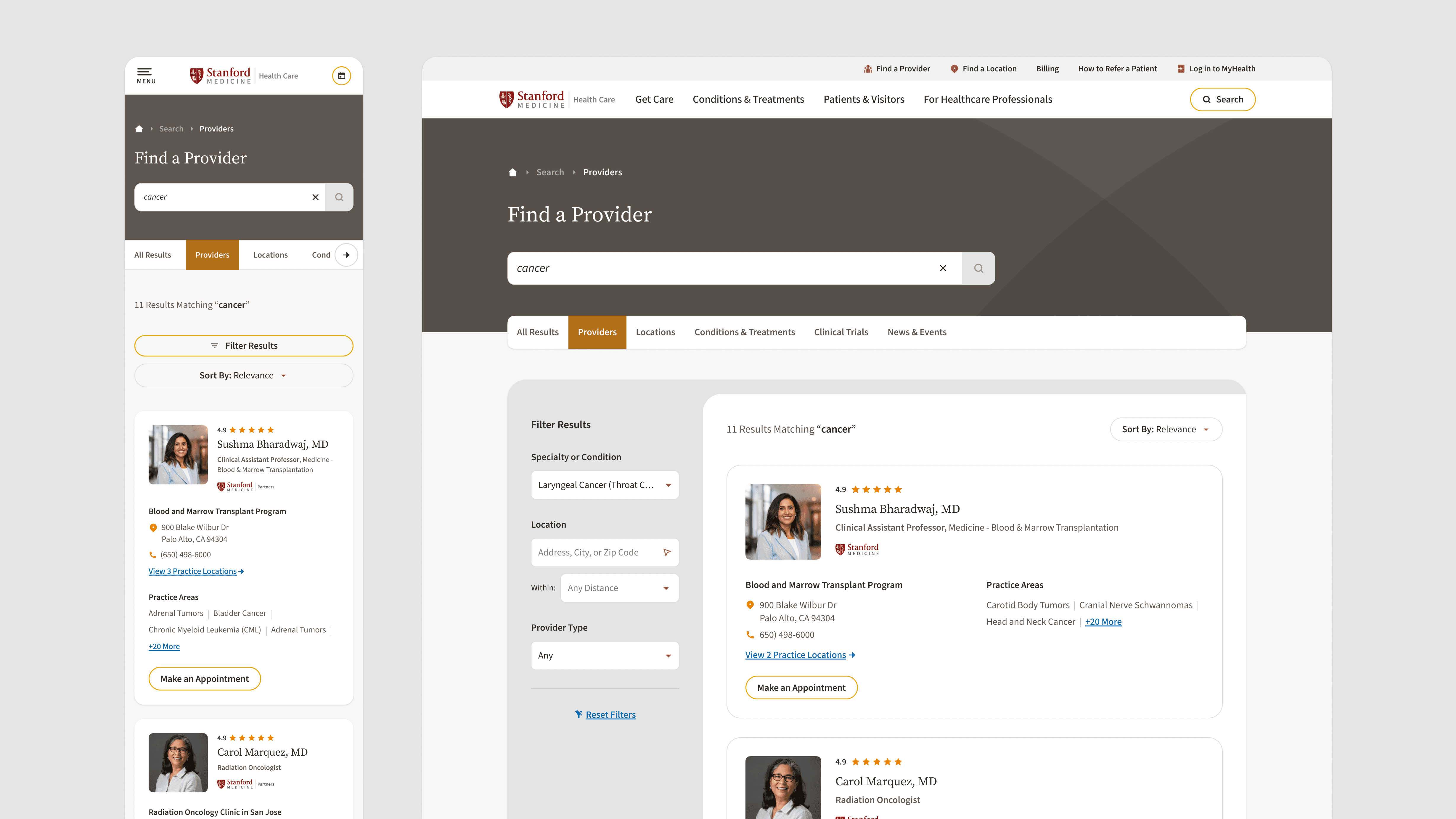
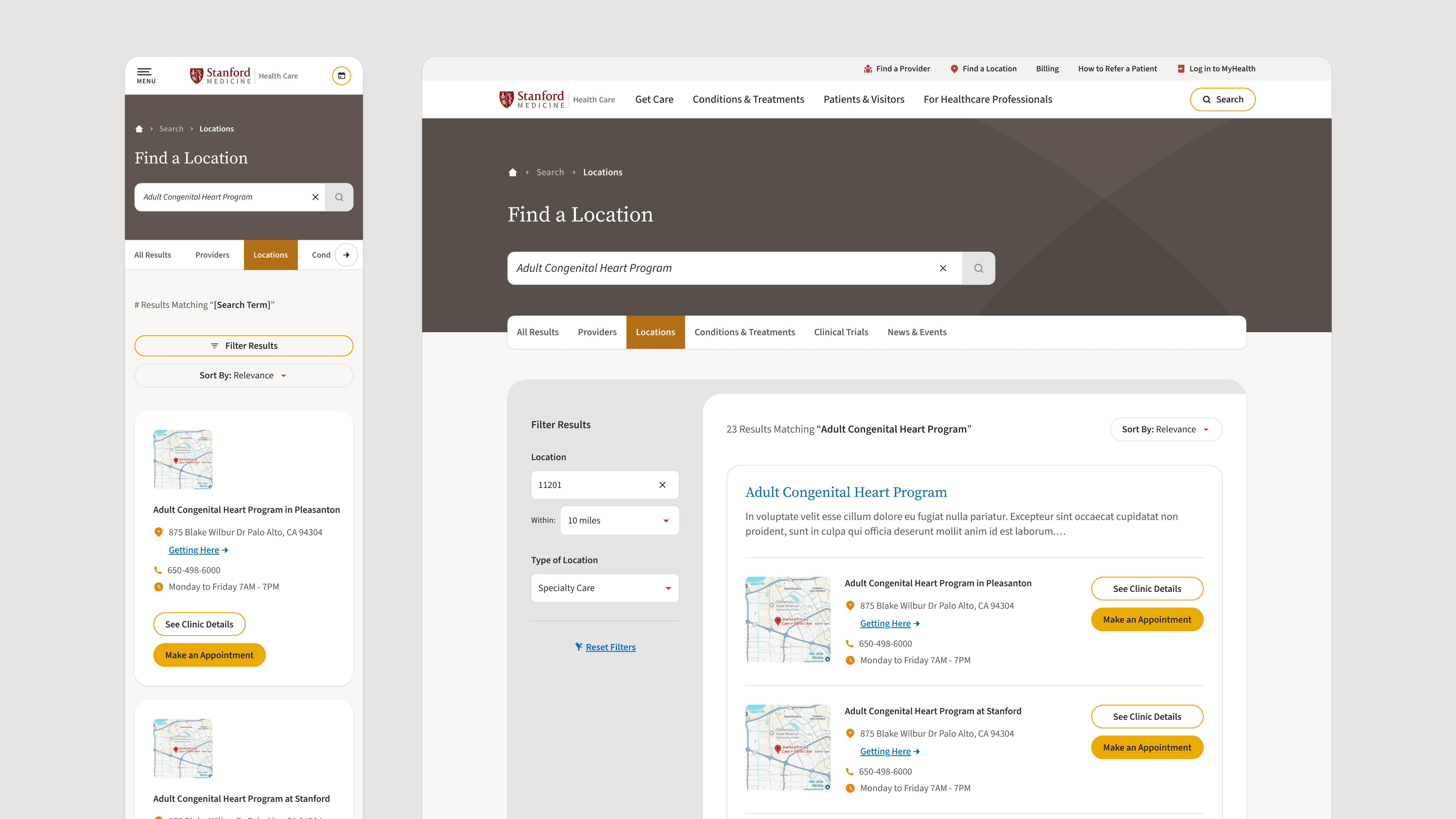
Search is a Location-adjacent task, so the shell sits under a Clay header. Clay carries place, groundedness, and infrastructure, which is the right frame. It also sets the environment once, at the top, and then stops.
Below the header the shell goes neutral. Results are dense reference content, and the entity switcher, input, and filters are utility controls, so they take utility styling rather than a primary. The rule is the same one that governs every long page in the system: patient tasks trump branding. Nobody scanning forty provider cards needs a color telling them where they are.
The switcher follows from that. Swapping the active entity changes what you're searching, not what the page looks like. Clay holds above, neutrals hold below, and the mode change happens without recoloring anything.



Outcomes
The component library is complete: 78 component sets, roughly 400 variants, a 586-icon set. Six token collections covering color, spacing, typography, sizes, borders, and prototype values.
About fifty modules and four layout templates. Dozens of accreted page types resolved into five entity classes and defined layout templates. Nine batches cleared weekly client review without re-scoping. Annotated specs and documentation delivered to engineering.

