Gravity Blankets
eCommerce Site Redesign
What the rebuild covered
Gravity sold weighted blankets. The catalog, the navigation, and the product pages were all built around that one product. The brand was moving into rest and recovery as a broader category, and the site had nowhere to put the second half.
I redesigned the experience end to end as the sole UX designer across Win Brands Group's portfolio. The problem was making one store hold two product tracks without becoming two stores.
Add-to-cart rate rose 30%. Converted sessions rose 15%.
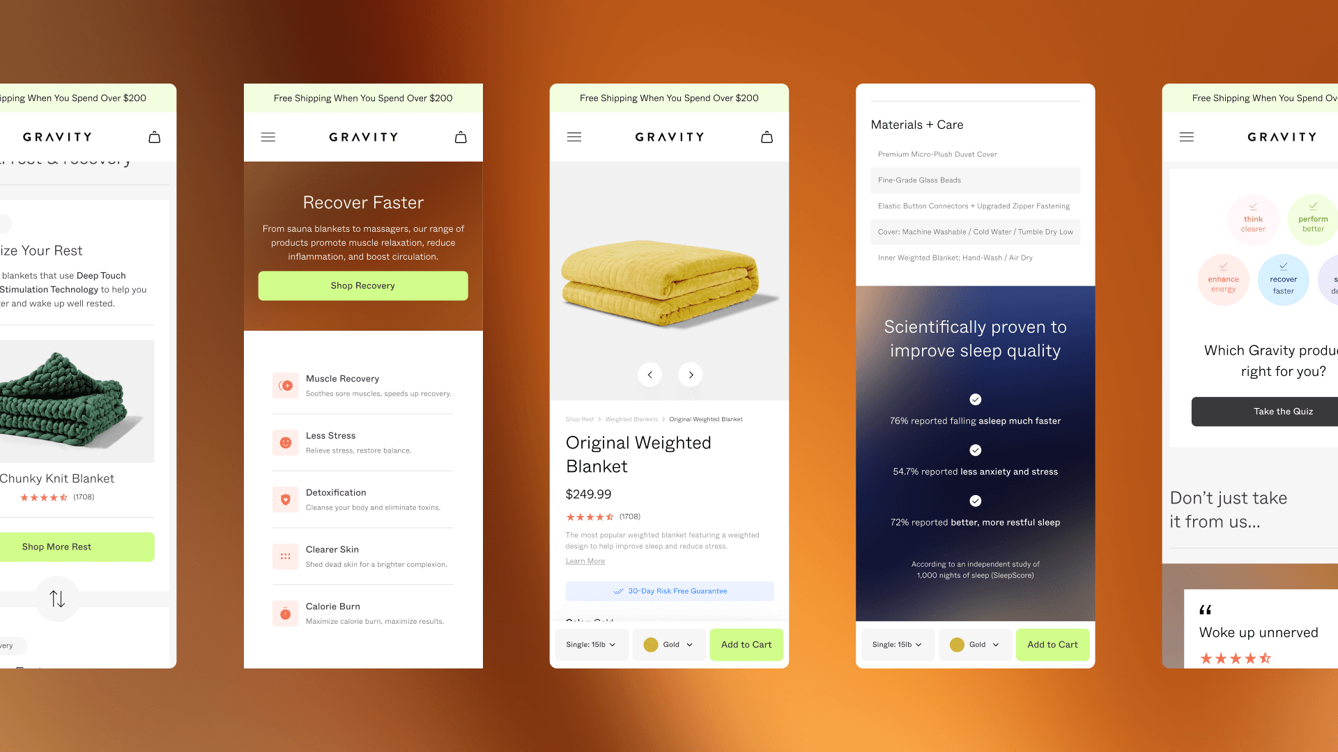


Rest and recovery
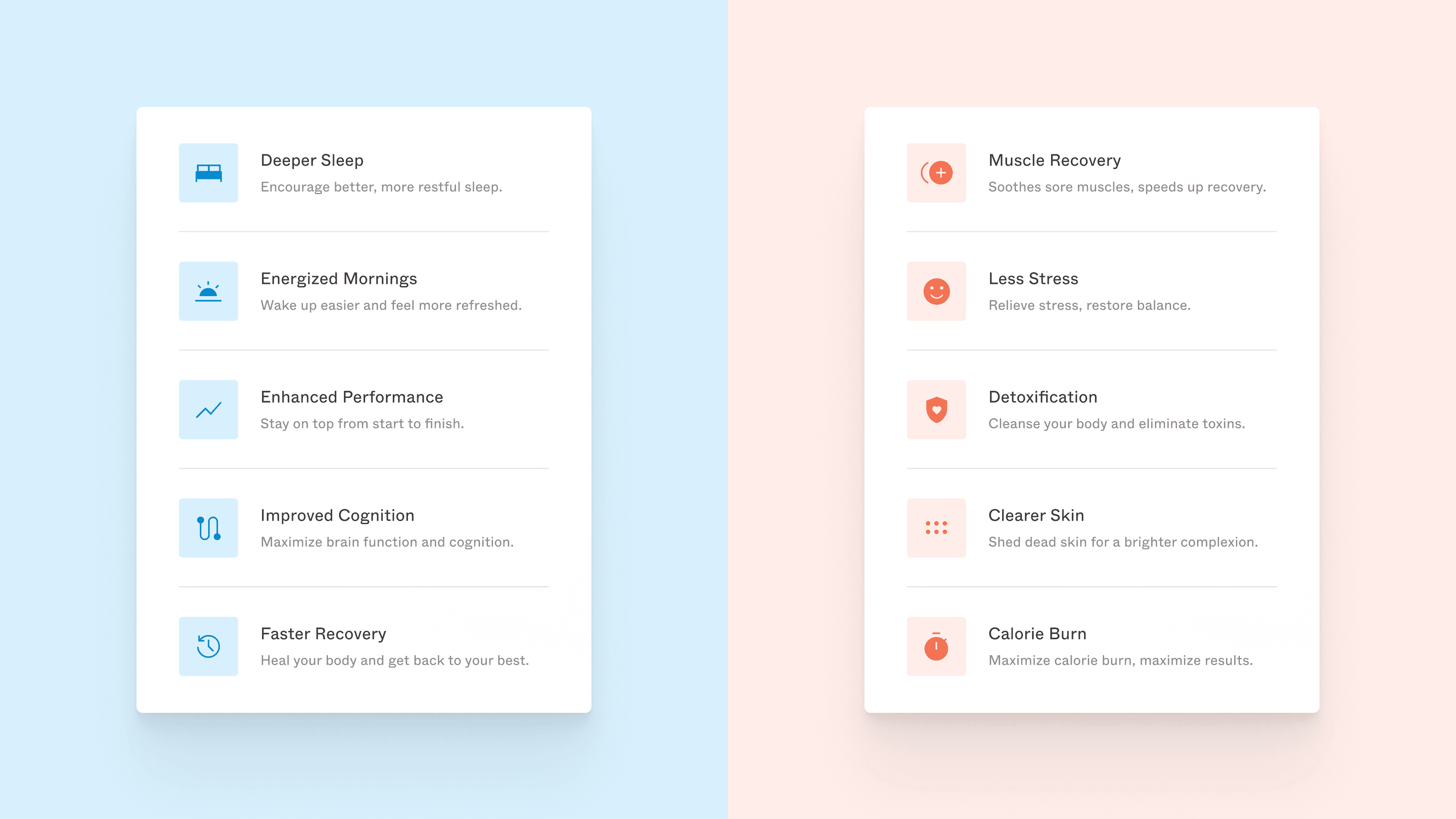
The catalog splits into two parallel tracks, and the interface says which one you're in before you read anything. Rest runs cool. Recovery runs warm. Temperature carries the taxonomy, so the distinction lives in the design rather than in a paragraph explaining the distinction.

Component library and handoff
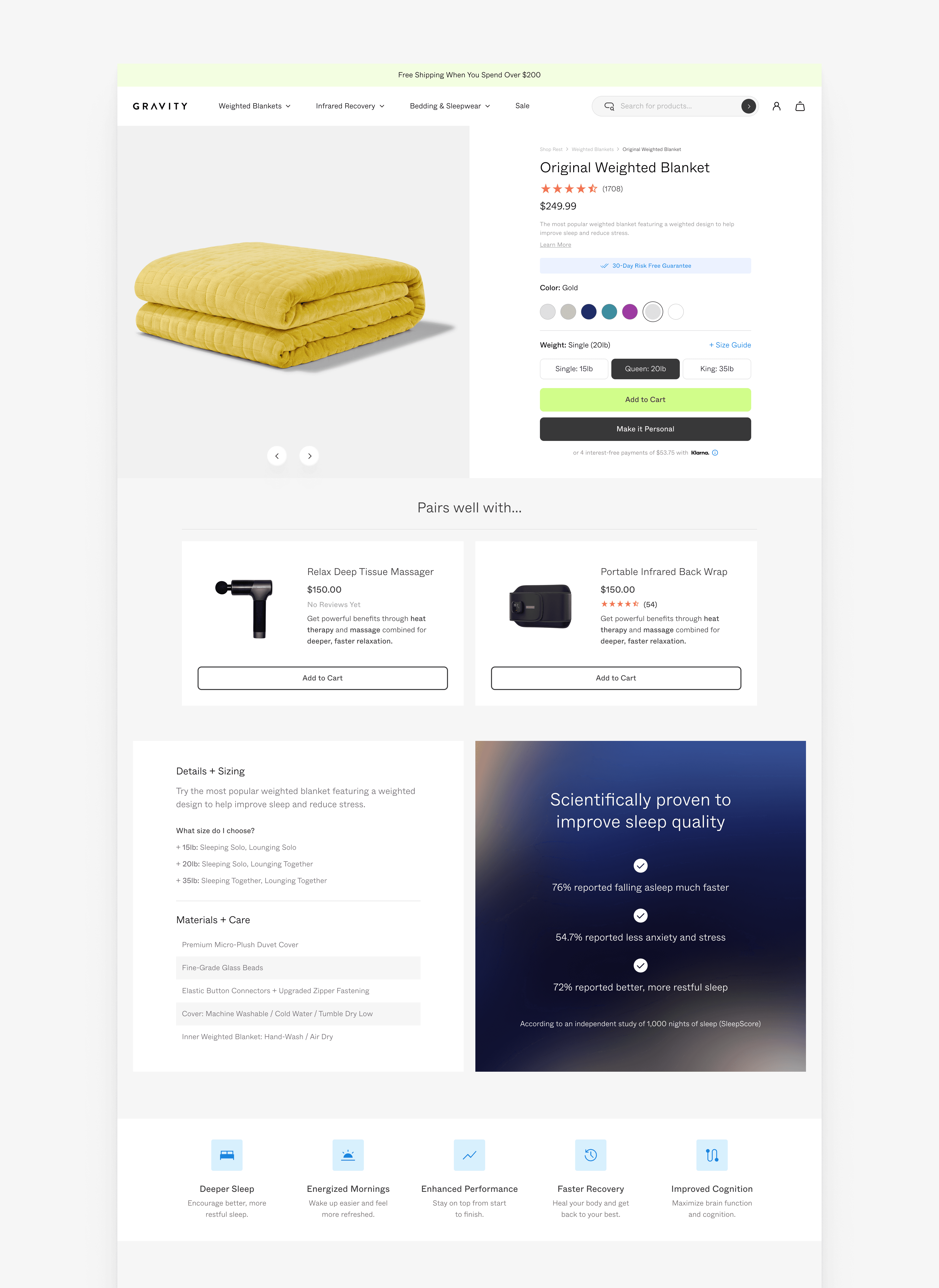
The old site was assembled from one-off pages. Every new product or campaign meant new layout work, and nothing carried forward.
I replaced them with a documented component library: composable patterns, specified for engineering handoff. New products enter the existing system instead of getting a page built for them.
